30 Apr Graphic Design Start to Finish Series: Steps 10-12
It has been said that great artists must first learn all the rules before they can break them. We agree, which is why we continue with some of the “rules” that graphic designers follow in our fourth series: Graphic Design from Start to Finish. Think of these rules as ways to establish boundaries for designing graphics for your business. Steps 10-12 in this series include not getting carried away with fonts, successfully varying fonts, and placing text on an image successfully. Our articles on graphic design steps can provide further information for starting to design (Steps 1-3, 4-6, 7-9). These articles contain resources which assist taking design from concept to creation, even for someone a tad intimidated by the process! Being able to access a few simple tricks can truly impact the way that a company’s graphic design is received by your audience.
Graphic Design Help for Your Business
You can learn anything with the right kind of education and practice. Graphic design skills are the same. Quality design is not reserved solely for people considered to be prolific artists or designers. Some things to consider when looking over your design project:
10. Don’t Get Carried Away with Fonts – The overuse of differing fonts causes graphic designers to cringe. A general rule to follow when choosing fonts is to limit your font choice to two differing fonts only. This will guarantee your design maintains consistent appearance throughout. You can easily communicate your message, without overwhelming the viewer, by keeping your font choice minimal. When selecting your 1-2 font choices, choose fonts that communicate functionality and readability. Your audience may not be able to read that super flowy script, so don’t use it! It is acceptable to choose one fancier font and pair it with a font that is basic such as a san-serif. The fancier font is ideally reserved for phrases or words that are catchy or are included in titles or headers of your piece. The more basic font will serve to communicate details and the bulk of your text. Try remaining consistent with these two fonts for your entire campaign or project.
11. Font Variations– Another suggestion is to choose fonts within the same font ‘family.’ A font family is a grouping of the same text style with shared design qualities. Using fonts within the same family can achieve variety to your designs while keeping your visual message consistent. One example is to use Rockwell, considered a basic font, and then use Rockwell Bold, Rockwell Condensed, or Rockwell Italic within the design. The use of these variations of the same font will maintain uniformity to design, while adding the right amount of variation. If you want to opt for differing fonts, remember to keep font families similar and complementary and use one basic and one fancy font in a design. To find ideas that work well together, look over well-known advertisements in magazines, on websites, billboards, or on social media—this will help you get a feel for what works when choosing the right fonts.
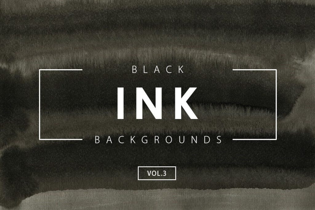
12. Text Over an Image Can Work – Considering adding text over a photo? This can be tricky! Adding text to an image requires an understanding of the image qualities, as well as the image to text ratios. The image to the left shows a strong example. In this photo, text over an image has been communicated effectively. The text can be read and is bold, and the message is not lost. In order to make this work, it is imperative to keep the text limited to a feature word or a very short statement. Using bold fonts, larger sizes of font, or setting the text off with graphic elements (such as the bracket seen in the photo) can also assist with functionality of the design. These tips ensure your message is easy to read, and therefore communicates your concept effectively. Consider also taking the image and adjusting the brightness (lighter or darker) to set your words apart. Color overlays are also helpful but remember that this can also bring another set of problems which require additional working of the image. Try placing text in such a way as to take the viewer visually through your image (see image to the right). Other options are to put text over a photo by placing the text in a box with a transparent background color, blurring the background image -leaving only important parts of an image – and adding text on a background color. Final tips on placing text on an image can be to keep the image and text choice simple, or try utilizing contrasting colors within text and image choices.
In House Graphic Design Assistance from Start to Finish in East Tennessee
At Acme Printing, we love graphic design, and we love even more helping you see your ideas go from inception to finality. If you have an idea, but do not have the time to put your concept together, we have the experience and talent to design whatever you need. Reach out today by phone at (423) 581-8528 or online.
Sorry, the comment form is closed at this time.